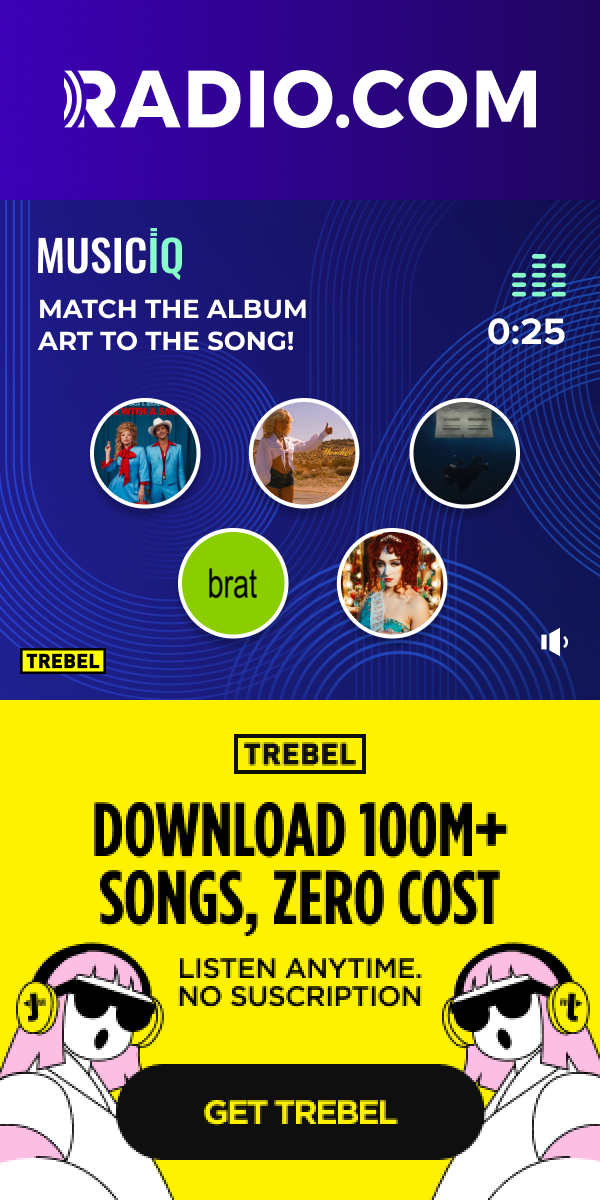
MusicIQ is a gamified mobile interstitial that converts the skip moment into an engagement moment — playing a music clip and asking users to match it to the correct album art before a timer runs out.
I designed MusicIQ end-to-end: mechanics, interaction states, motion behaviour, brand system, and ad adaptations. The design problem was a product one — how do you make a unit people choose to engage with instead of dismissing?
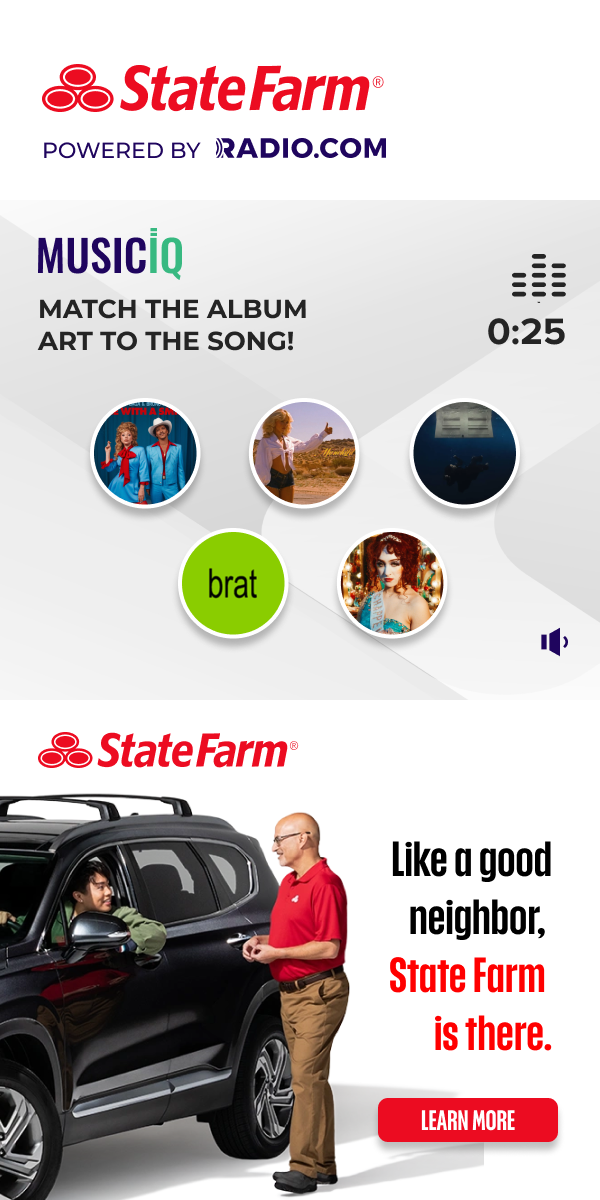
The format proved compelling enough that State Farm purchased a co-branded version, validating MusicIQ as a standalone revenue product with genuine interactivity beyond standard pre-roll.
Pre-roll is a
skip reflex.
Mobile pre-roll ads have a fundamental UX failure: the most visible action is "Skip." The user's instinct is trained to dismiss before any brand message lands.
Passive format
Standard pre-roll requires zero interaction. Users tune out or skip at the first available moment — usually 5 seconds in.
Music = native context
Inside a music discovery app, the audience is already in a listening mindset. A music game doesn't feel like an ad — it feels like the product.
Convert skip to play
Replace passive consumption with a 25-second interactive game. The user makes a choice, gets feedback, feels something — and the brand CTA follows that peak moment.
Four steps.
One engagement loop.
The core interaction loop was designed to feel like a game round, not an ad unit. Every state has a clear purpose and a deliberate emotional beat.
Music plays
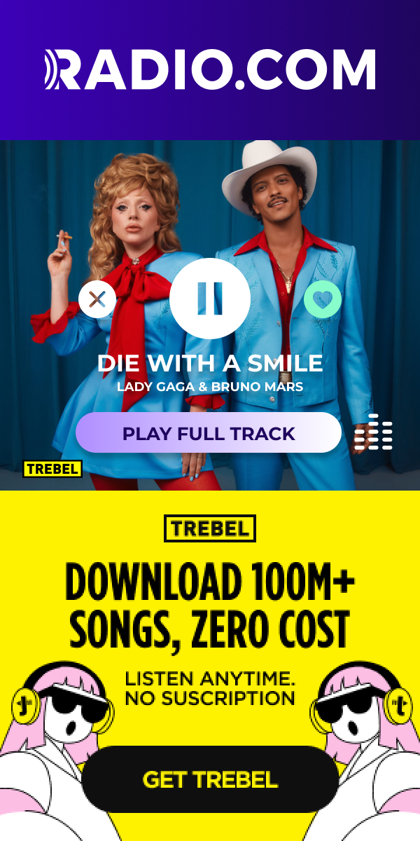
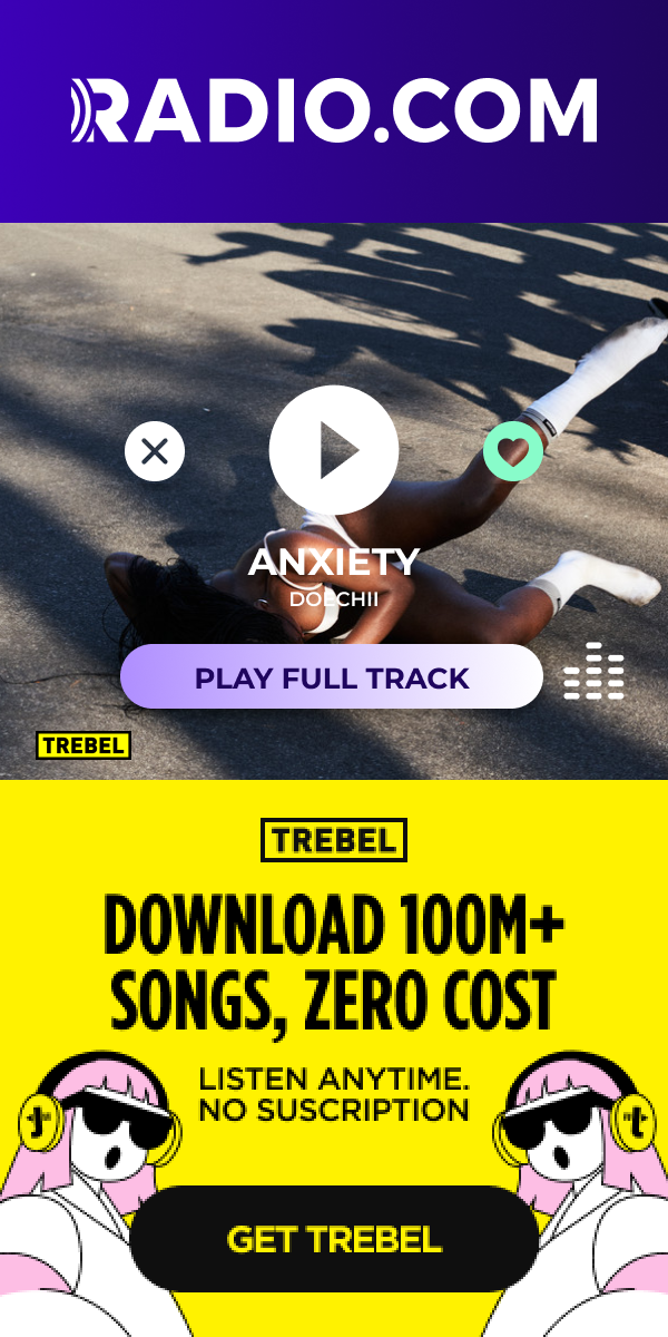
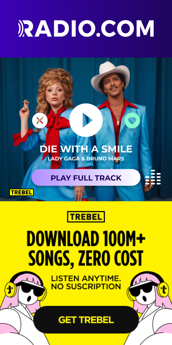
A 25-second clip from the catalogue autoplays with a waveform visualizer and countdown timer. Audio-first — the visual is secondary to the listen.
Make your pick
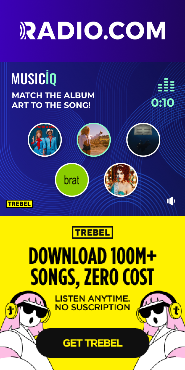
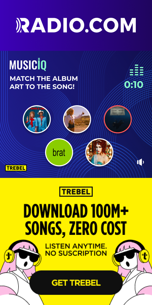
Five album art tiles appear. The user selects which matches the track before the timer expires. Choice architecture: options are visually similar enough to require genuine listening.
Result & reveal
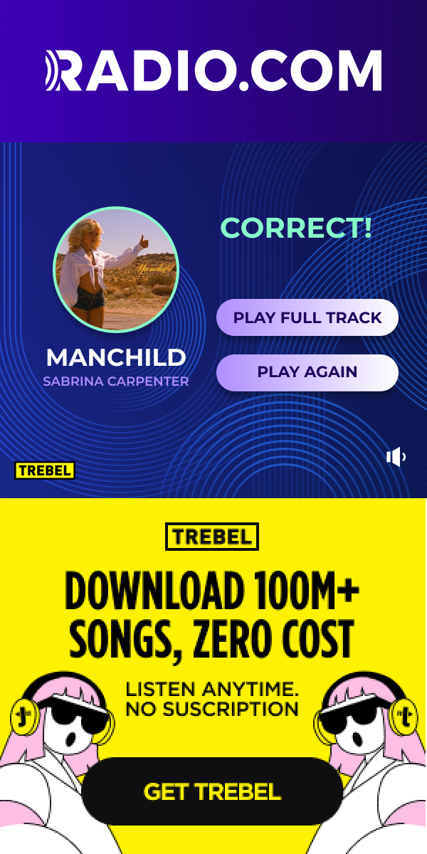
Correct: celebration state with haptic-style feedback. Incorrect: the right answer reveals with artist context — a discovery moment baked into a miss.
Brand CTA
Post-game, the brand action appears at peak engagement. The user has just finished something — they're receptive. CTA follows earned attention, not interrupted attention.
Play the real unit.
The live MusicIQ production unit is embedded directly. Play a clip, pick the album art, see the result — same logic, states, and feedback as in-app.
Timer as tension
The countdown isn't just UI chrome — it's the core pressure mechanic. A 25-second timer matches the clip length, so the game ends exactly when the audio does. No dead air, no disconnect.
Wrong answers teach
An incorrect pick doesn't feel punishing — it reveals the right album with artist context, turning a miss into a music discovery moment. Negative feedback states still serve the product goal.
CTA after earned attention
The brand call-to-action appears only after the game resolves. The user has just finished something — dopamine loop complete — making them more receptive than any cold pre-roll impression.
The thinking behind
the choices.
MusicIQ wasn't just visual execution — it required product-level decisions about interaction architecture, feedback design, and brand extensibility.
5 choices, not 4
Four options felt too easy — patterns from other trivia games made it guessable without listening. Five creates genuine ambiguity and forces engagement with the audio clip itself.
Choices appear staggered
Album art tiles stagger in after the clip starts playing rather than loading immediately. This forces a minimum listen time and prevents users from guessing before engaging with the audio.
Celebrate the correct, don't shame the miss
Incorrect states show the right answer rather than a punishing red X. The user learns something. This keeps the emotional arc positive even when the user guesses wrong.
Format-first, brand-second
The game mechanics were designed to be brand-agnostic from day one. Color palettes, logo placements, and CTA copy were the only variables needed to adapt MusicIQ to State Farm — no structural changes required.